Learn how to build graphs and visualize your data as its being collected.
new
On Teamscope you can create graphs and visualize your data as its being collected — in real-time.
To create a graph go to Analytics on the web dashboard and click on “Create graph”.

Choose from the dropdown the type of graph you want to use. You may choose from bar, pie, line and basic statistical analysis.

Select the form you want to plot your data from and the actual field that you want to be represented in this graph:

To refresh a graph and see the latest data all you need to do is click on the refresh button.

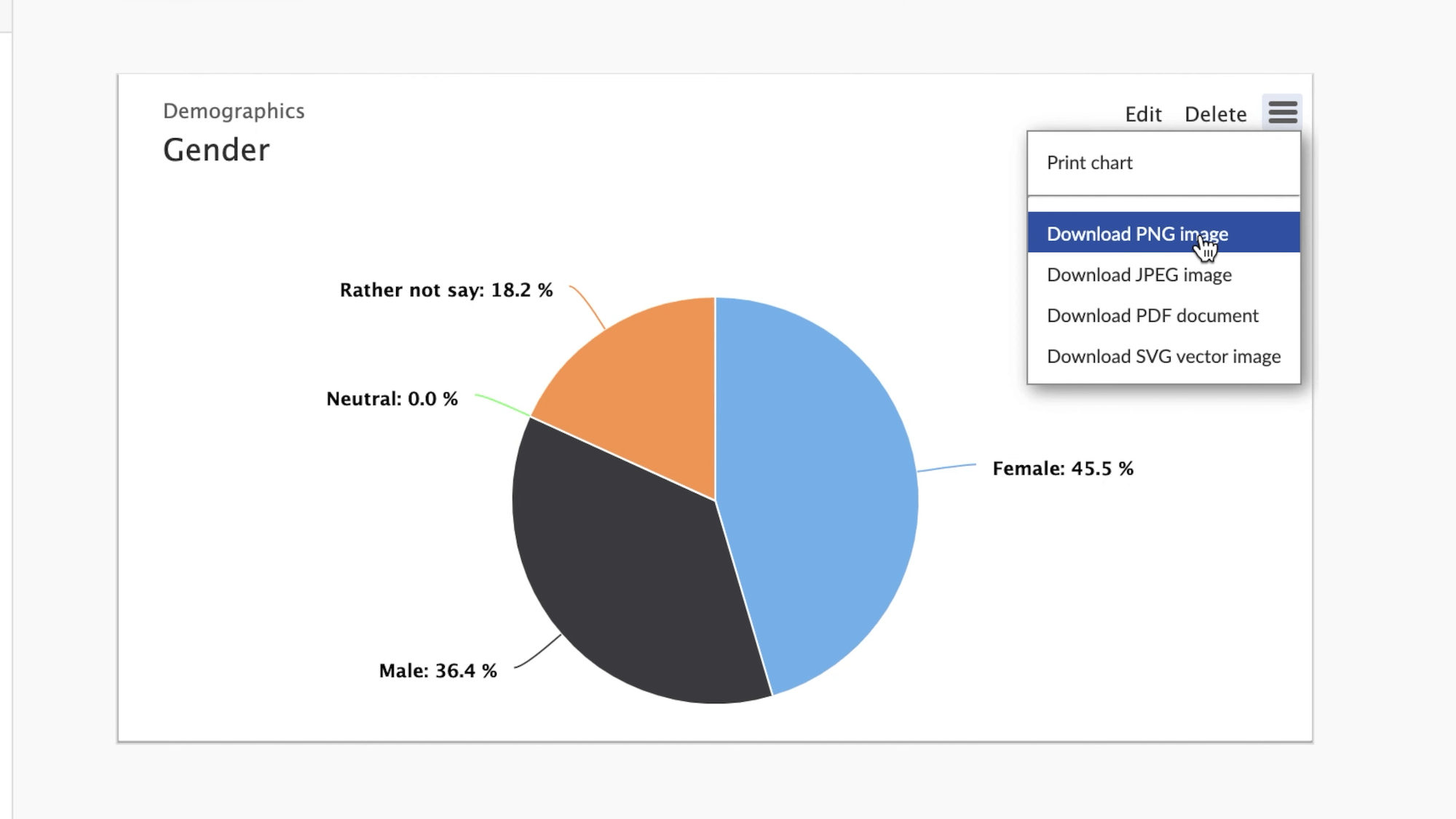
Finally, you can export your graphs as an image and insert them on reports, presentations or emails.
On Teamscope you can create graphs and visualize your data as its being collected — in real-time.
To create a graph go to Analytics on the web dashboard and click on “Create graph”.
Choose from the dropdown the type of graph you want to use. You may choose from bar, pie, line and basic statistical analysis.
Select the form you want to plot your data from and the actual field that you want to be represented in this graph:
To refresh a graph and see the latest data all you need to do is click on the refresh button.
Finally, you can export your graphs as an image and insert them on reports, presentations or emails.
